Creating a brand for revolutionary on-chain payment gateway
Project
Swype Branding
Year
2025
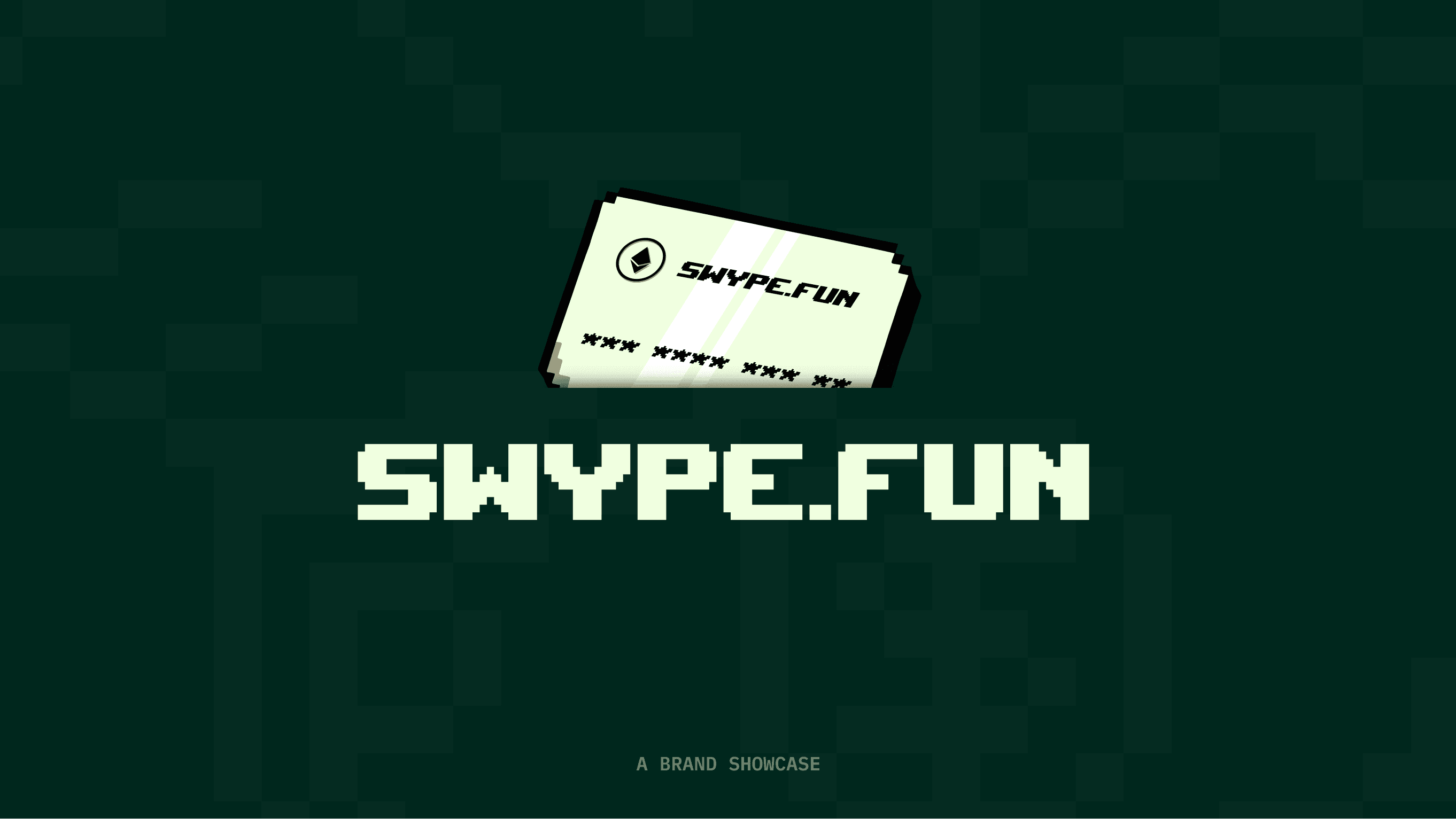
Swype.fun is a sub-brand incubated by Brahma.Fi, built on a trajectory toward becoming a super app for global payments powered by the Swype SDK. The SDK functions as an orchestration layer, unifying onchain finance, Visa card rails, and EUR/USD bank accounts within a single application.
Scope of Work


Branding Swype: Old Money Meets Early Internet
Every crypto brand chases the same instinct: look futuristic, look trustworthy, look credible. Swype needed something else entirely.
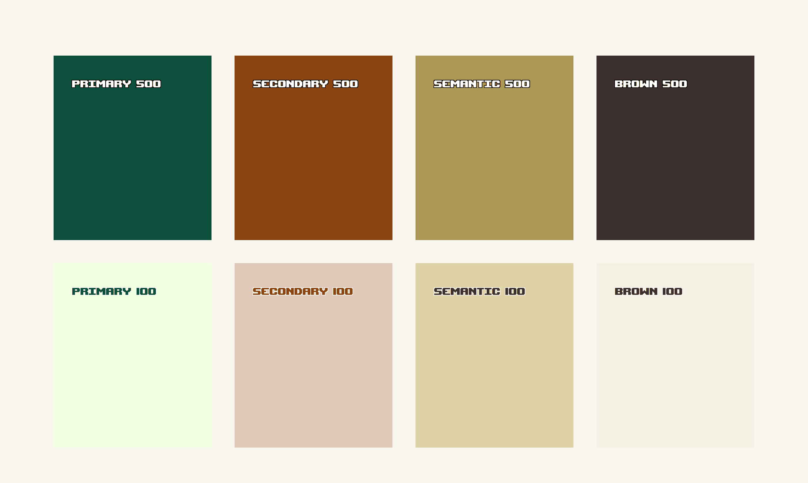
The brief from the founders wasn't about looking trustworthy in the way fintech usually performs trust: clean gradients, soft blues, corporate reassurance. Instead, it called for a design language that was harder to fake. Being bold mattered more than ever, creating a fun design language that doesn't need to prove itself, because the actual audience was crypto-native and terminally online, a young generation raised on the internet's rawest era, before design systems and brand guidelines flattened everything into the same sans-serif sameness. So the brand had to hold two contradictory truths at once: the cool-kid nature of the app, and the authenticity of early internet, unpolished, a little nostalgic, unmistakably human.
Branding Swype: Old Money Meets Early Internet
Every crypto brand chases the same instinct: look futuristic, look trustworthy, look credible. Swype needed something else entirely.
The brief from the founders wasn't about looking trustworthy in the way fintech usually performs trust: clean gradients, soft blues, corporate reassurance. Instead, it called for a design language that was harder to fake. Being bold mattered more than ever, creating a fun design language that doesn't need to prove itself, because the actual audience was crypto-native and terminally online, a young generation raised on the internet's rawest era, before design systems and brand guidelines flattened everything into the same sans-serif sameness. So the brand had to hold two contradictory truths at once: the cool-kid nature of the app, and the authenticity of early internet, unpolished, a little nostalgic, unmistakably human.


The tension between the brand became the design language. Not a compromise between the two ideas, but a deliberate friction: the app's fun, cool-kid energy filtered through a lens of digital nostalgia. Rather than lock that language in place, we let it evolve with the product. Each version of Swype's tech would ship alongside an evolution of its visual identity, starting with a raw, early-internet feel for the beta, then maturing in step with every technical milestone. The interface wasn't just showing users a more capable app with each update; it was showing them a brand growing up in real time, becoming more refined the further the product matured, a visual signal, layered quietly into every release, that Swype was a platform still very much in motion.
The tension between the brand became the design language. Not a compromise between the two ideas, but a deliberate friction: the app's fun, cool-kid energy filtered through a lens of digital nostalgia. Rather than lock that language in place, we let it evolve with the product. Each version of Swype's tech would ship alongside an evolution of its visual identity, starting with a raw, early-internet feel for the beta, then maturing in step with every technical milestone. The interface wasn't just showing users a more capable app with each update; it was showing them a brand growing up in real time, becoming more refined the further the product matured, a visual signal, layered quietly into every release, that Swype was a platform still very much in motion.


Closing note
Swype scaled fast. Within the first week of launch, it was already the subject of conversation across tech Twitter, generating a volume of attention we hadn't planned for and honestly hadn't expected.
But the moment that stayed with me wasn't a metric. It was a screenshots & user stories shared inside our community. One user posted about he used his onchain position to pay for a Tesla. His caption read something like: "bitcoin paid for my car."
That's the moment the work stopped feeling abstract. As a designer, you spend months in Figma files and edge cases, refining flows nobody notices unless something breaks. You rarely get to see the exact instant your work touches someone's real life. That screenshot was that instant, and it's stayed with me since: proof that the brand and product I helped bring to life weren't just well designed, they were genuinely, tangibly useful.
Closing note
Swype scaled fast. Within the first week of launch, it was already the subject of conversation across tech Twitter, generating a volume of attention we hadn't planned for and honestly hadn't expected.
But the moment that stayed with me wasn't a metric. It was a screenshots & user stories shared inside our community. One user posted about he used his onchain position to pay for a Tesla. His caption read something like: "bitcoin paid for my car."
That's the moment the work stopped feeling abstract. As a designer, you spend months in Figma files and edge cases, refining flows nobody notices unless something breaks. You rarely get to see the exact instant your work touches someone's real life. That screenshot was that instant, and it's stayed with me since: proof that the brand and product I helped bring to life weren't just well designed, they were genuinely, tangibly useful.
More Projects

Trusted by many
Trusted by many